
I sat down to write a bit about why we’ve chosen to mimic the aesthetics of vintage comics in our game and what goes into making it look authentic. To be more specific about the influences; we mostly draw from the golden- and silver-age comics that originated in states—your Super-mans and Wonder-Womans—and the ones from European parallel periods, like Asterix, Tin Tin, Lucky Luke and what have you. I’ll point out straight away that this won’t be a tutorial on how to make a game look like a comic, nor will it be a piece of well-researched journalism—though feel free to correct me if I say something egregiously wrong. There’s also going to be some over-simplifications to keep this tight. Let’s just be safe and say it’s a collection of thoughts and notes, okay?
Before we dive head-on into this comic stuff, let’s take a short detour to talk a bit about something that crystallizes the point of this post. Raison d’être is an expression coined by Philosopher John Stuart Mill in the 17th hundreds, meaning ‘the reason to be’ or ‘a purpose of existence’. Some examples of this could be: a chimney’s raison d’être is to let smoke out of the house, Michael Jordan’s is—or was—to play basketball, and Mozart’s was to make music. This blog’s raison d’être is to document the making of Paradigm Island. Now; let’s not forget this because we’ll get back to it later. Time for an awkward transition.
A teeny-weeny slice of comic historeeny
Back in the ‘good ol’ times’, comics were made for the newspaper’s ‘funnies’; the section at the end of the paper that contains comic strips. With limited time and technology, certain compromises had to be done and out of those compromises birthed an effective storytelling medium. As a side note—one could make the argument that the Egyptian hieroglyphics or illustrations on Greek vases were just ancient comic strips; I’m not making that argument since it’s not the point here.
“Comics have evolved to tell as much as possible in a confined space with the least elements necessary.”
About those compromises I mentioned; let’s say you’ve got a couple of hours to make a comic strip. Assuming you’ve got some kind of a story, joke, or message figured out, what would you get down first? That’s right; the outlines. Got a few more hours to spare? Maybe shading? A couple more? Background, maybe? What I’m getting at here is; the comic artists had to be very resourceful with the time they had and only draw what was necessary to get the point across. The comic makers had to know the—yes, you guessed it— raison d’être of every element that was put on paper. How’s that for delayed gratification? Anyway…the bottom line here is that comics have evolved to tell as much as possible in a confined space with the least elements necessary. Of course, modern comics—not to mention graphic novels—have much more space to express themselves but they still carry this history in their DNA.
Getting to the point
So why? What is our raison d’être for picking this aesthetic for our game? Why choose to use these neat 21st-century tools to recreate an old, flawed media? Do we really need one, besides that it looks cool? Maybe not—it’s just that picking an aesthetic like it’s a pack of cereal from a market shelf and then planting it on something in hopes it sticks doesn’t sit right with me. I don’t want this game to be a copy of a copy, exhausted of meaning and authenticity; a Frankenstein’s monster, glued together from whatever random bits and pieces we could find. I want it to be something thought out; living rather than just undead.
“With our look, we hope to be able to deal with heavy topics without the game becoming so gloomy no one bothers to play it.”
One thing this kind of visual style does a good job at is taking some weight off of the subject matter it deals with. In our case, we hope the playful and cartoony look will balance the foreign, bleak-in-tone, and futuristic setting of our game, helping it feel a bit more grounded if you will. One more for the road; with our look, we hope to be able to deal with heavy topics without the game becoming so gloomy no one bothers to play it. The visual storytelling–starting with aesthetics–communicates there’s also humor. The style could perhaps even be categorized as camp since it’s gaudy, exaggerated, and ironic.
If I was to name a few pieces of media outside of comics that greatly benefit from their cartoony aesthetics, the TV-show Bojack Horseman is the first one to come to mind. If the show was told in different form; with real actors, for example, it just wouldn’t work. Of course, the case is a little different with games–though they have actors too nowadays–but I don’t think the medium is as relevant to the topic here as the form.
More on making things feel ‘grounded’
If you’re about to yank the viewer–or in this case; the player–to a world unfamiliar to them, you should at least show some human decency and let them bring something to remind them of home, right? If you just dump a truckload of new stuff on them, they’ll run away scared. I think it’s safe to say that everyone’s familiar with comics and most of us that have reached adult age by now have a nostalgic relationship to them.
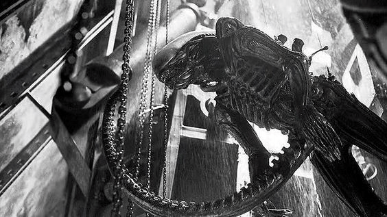
An example of grounding that pops into mind is from the first Alien movie and the scene in which the alien kills Bret, one of the Nostromo’s crew members. The chains (image below) hanging from the ceiling in the scene do a great job of grounding it, working as an anchor of sorts to the world familiar to the viewers; this way, it’s easier to place oneself in the situation at hand and the world of the movie. Without the chains, the sci-fi setting would feel a tidbit too other-worldly to be scary if you ask me. The added dripping water is the icing on the cake. Of course; sometimes you *want* the scene to feel alienating–pun intended–but let’s not go on a tangent here. I know this was a bit of a stretch but when I saw a video on Youtube talking about this scene, something clicked with me so I thought I’d share. Let’s get back to comics.
“Paradigm Island’s inhabitants are often morally ambiguous, selfish, and prone to temptations, with no metanarratives to guide them.“
Comics were originally not just a medium for comedy but for political satire as well. By choosing this visual style, we tip our hats to the past and continue the tradition in a new medium. It goes without saying that some things–like racial stereotypes and sexism–are better left in the past but we can still appreciate the things done well; at least as an expression of skill. Arguably the first American comic, ‘The yellow kid’–and the yellow here not signaling anything racist–was made to, and I quote: “to make wealthy readers more sympathetic to the plight of the poor.”
The heroes in the golden- and silver-age comics were depicted as moral role models who fought for the greater good; strong in their beliefs, courageous and virtuous, existing naively in a world in which the lines between right and wrong were clear. This isn’t the case with our game. Paradigm Island‘s inhabitants are more often than not morally ambiguous, selfish, and prone to temptations, with no metanarratives to guide them. The contrast and irony aren’t hard to draw; in a way, the medium becomes the message.
B-b-b-break it down!
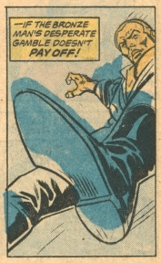
So, what steps do we take to make our game look like a vintage comic? I’ll start with an obvious one: outlines. They make the shapes fast to read and help us control the visual hierarchy of what is shown. In other words: it makes different objects stand out clearly. Yeah–water is wet–I know. Moving on.
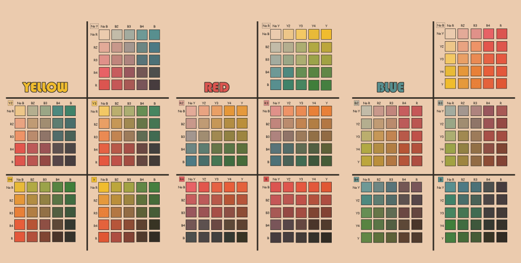
Next up: limited set of color. We use a color palette consisting of yellow, blue, and red (magenta). On top of that, we have white and black. Of each color, there’s a solid 100%, 75%, 50%, and 25% versions and the palette consists of different mixes of all those shades. For example: orange’s color code would be Y4R3; Y4 meaning solid yellow, and R3 75% red.
Ink bleed: when the image is printed on the paper, the capillary effect moves the ink on the paper before it gets to dry, making edges a bit jagged if you look closely. It’s a subtle effect–yes–but subtle effects add up.

Fourth: halftone, meaning little dots that create gradients and color combinations when varied in size and spacing. For example, to create orange color, we would overlap solid yellow dots with 75% red ones. There are different styles too: like in the image below we could also layer red dots on top of a solid yellow. The size and spacing can vary significantly, depending on what was the budget for the comic and when it was made.
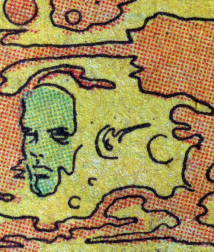
Misaligned linework and color: If I’ve understood it correctly, back in the day the black-and-white art was sent to the production department and colors were laid down separately. Other times the artist would color the images and then they would be recreated by the color separators. The colors made by the artist would’ve been only guides and never saw print exactly as how they were intended. Sometimes the overlays would slip and an object would have the color a wee bit to the side; that’s why it seemed like the comic artists couldn’t stay within the lines when coloring.
Aging: the colors would fade over time and the pages would get a yellowish tint. Also; the pages rubbing against each other would wear the images and colors. The image of old comics most of us–born way after the ‘golden age’–have is not accurate of how they were straight out of printing.
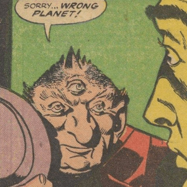
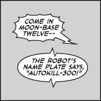
Almost forgot! speech- and thought bubbles: These are the first thing to come to mind when talking about comics, are they not? Though bubbles are nowadays mostly seen as corny and replaced with narration boxes, which can too sound a little dated if not applied properly. Like in the image below, the visual style of the bubble can tell what the source of the sound is, for example, a walkie-talkie or a robot. With a text-based game like ours, these visual cues help tremendously to get the point across.
Narration boxes: In vintage comics, the narration box was reserved for the omniscient narrator but in the modern ones often used to give a glimpse into the mind of a character. When comparing the narrator box to a thought bubble as a means to describe the thoughts of the character, I think it’s safe to say the narrator box feels more elegant and the thought bubble more comical. Since we are going for the nostalgic and comical tone in our game, we’ll most likely use both, depending on the situation.

Lastly, there’s the editor’s footnotes, mostly seen in older American comics. In context of our game, they could be used to give more information about the world or the main character’s past but that’s something we haven’t been talking about much yet.

I hope I didn’t miss anything crucial. If I did, I’d love to hear about it! we’re still figuring out which of these elements will be done in the actual texturing of the 3D models and which in post-processing. Some of them could still be dropped and something else added; after all, our aim is not to recreate the style of vintage comics religiously or stick to one specific look from a certain period but to come up with an identifiable and intriguing look.
If you want to follow the development of our game or just share our interest in all things art, consider subscribing to our email list by clicking the button below; that way you’ll get notified whenever there’s a new blog post or other news about the game. If you got anything to ask or feedback to give, you can leave a comment below or email me at oskar.riekko@paradigmisland.blog
